
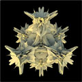
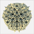
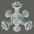
We’ve all heard of generative graphics, how about generative architecture? The computational experiment Platonic Solids by Michael Hansmeyer is something you can get lost in for a good while. Especially since he’s added a 3-D anaglyph presentation. I hope you kept a pair of red-cyan 3D glasses in your junk drawer like I did!
Category Archives: Visualization
Visualization
New Direction: Computational Biology
After an absurdly long job search, I’ve finally found myself a comfortable place in a computational biology lab. I’ve been here a bit more than a month and thought I should mention something about what I’m doing.
I’m working for Dr. Michael Brudno in the Computational Biology Lab at the University of Toronto. At the moment, I’m developing an application for visualization and analysis of biological sequence and annotation data with a graduate student named Marc Fiume. (We just chose a name for our project today: SAVANT. I like it.) I’m also sitting in on a graduate seminar on analysis of high throughput sequencing data and attending the occasional presentation on related research at The Centre for Applied Genomics. I’ll be spending one day a week at Sick Kids hospital, in order to interact with biologists and bioinformaticians who are among the target users of SAVANT.
I’m having a great time.
This is all a huge change from the enterprise web development that is more or less what I’ve been doing since 1996. A huge change that I really needed. Sometimes you just need to start over, you know? It was getting to the point where I honestly couldn’t picture myself actually taking any of the jobs I was applying for. I couldn’t face the same-old, same-old any longer.
I’m not sure where this is all going to lead, but I’m kind of hoping to make a career in this relatively young field. I believe that my many years of experience in commercial software engineering will be useful here. I think I can have fun and make a difference. The territory is huge; the problem space practically inexhaustible. I can’t imagine getting bored any time soon. Heading off in a new direction feels exactly right. So work-wise right now, it’s all good. 
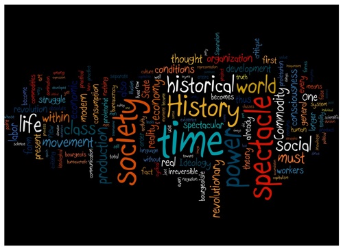
Spectacular Words
A fun tool called Wordle allows you to create “beautiful word clouds” from any text. You have control over layout, colour, font and other things. I created this specimen using the text from Guy Debord’s Society of the Spectacle. You can also browse (and contribute to) a gallery of word clouds on the site. Enjoy.
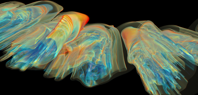
Visualizing Turbulence and Interpreting the Elements
I stumbled across two nice representations today. The first is a series of images visualizing turbulence. Some of these models took millions of processor hours to compute.
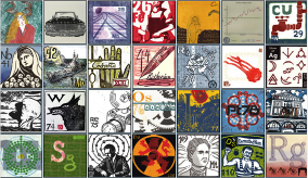
The second is a periodic table of the elements assembled out of 118 prints in various media. Sadly, no poster seems to be available just yet, but the project initiator hints that many things are in the works. Wouldn’t high school chemistry have been more fun this way?
The Structure of Your Social Network
LinkedIn is the only “social networking” site I use. What it doesn’t have that I really want is a visual map of the structure of my social network. The structure of social networks in general is a hot research topic*. But I want to see what my social network actually looks like. Preferably out to 3 degrees of separation, with first and second degree nodes labelled with names (and links, natch.) It’s not enough to know who has lots of connections; I want to know with whom I have a high number of shared connections, i.e. who is a hub in my personal network. I also want to see the clusters that form in my own network. Some of these may be surprising, especially if 3rd degree links are included.
The real questions are: 1) is this something anyone else really cares about, and 2) is this something that LinkedIn would be loathe to provide—just as Google gives up zero information about link topology with its search results, presumably quite on purpose?
I could no doubt construct such a visualization myself, but given the way LinkedIn is set up it would have to involve a lot of yucky screen-scraping. Do any other “social networking” sites do a better job of coughing up real data on the structure of your personal network? If not, are they doing anything useful with this information themselves? I suspect not, which is just such a waste.
*For the mathematically inclined I recommend Small Worldsby Duncan J. Watts. For more general readers, Linked
by Albert-Laszlo Barabasi is extremely readable and covers social networks and many other types of “natural” networks as well.
Seeing Sound
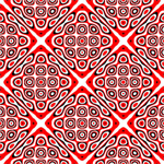
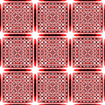
Ernst Chladni invented a way of visualizing the vibrations on a metal plate by sprinkling sand on the plate and making it vibrate using a violin bow. The sand scatters and collects at the places where the plate is not vibrating (the nodes of vibration), creating a fascinating family of visual patterns. The images below are artistic renderings of some of the many possible patterns. See more at the U Of T Physics Department and more gory details on the math from Paul Bourke—including some visualizations of what Chladni patterns in three dimensions would look like.
 |
 |
 |
 |
[Unfortunately, I haven’t yet found a good applet which demonstrates this behaviour. (Sounds like a perfect project for proce55ing!) If anyone knows of a nice visual demonstration, please let me know and I’ll update this entry.]